IELTS Task 1 Charts Sample Answer (UK Telephone Calls)
Here is a band 9 sample answer for you and a question analysis.
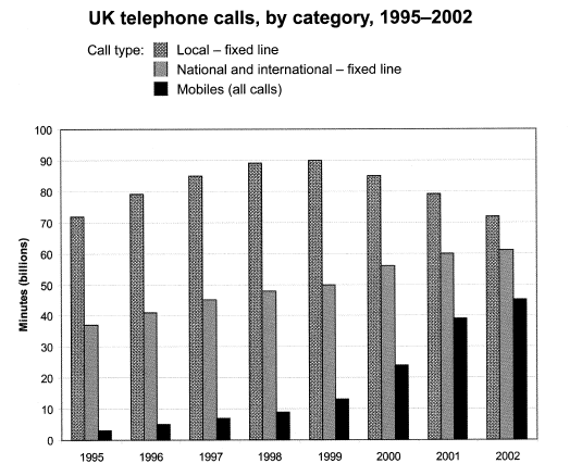
Question: The chart below shows the total number of minutes (in billions) of telephone calls in the UK, divided into three categories, from 1995-2002.
Summarise the information by selecting a reporting the main features, and make comparisons where relevant.

Source: Cambridge English IELTS Past Papers.
Answer
The bar graph shows the combined time spent in billions of minutes, on three different kinds of phone calls in the United Kingdom, from 1995-2002.
Overall, local calls were the most popular over the whole period, with national and international calls and calls on mobiles second and third respectively. However, the number of minutes spent on international and national calls and mobiles both increased over the period, with mobile minutes increasing dramatically, thus narrowing the gap between the three categories by 2002.
Minutes spent on local calls fluctuated over the period, with just over 70 billion minutes in 1995, peaking at approximately 90 billion in 1999 and then steadily decreasing to just over 70 billion minutes in 2002.
National and international calls increased steadily year on year, from just under 40 billion minutes in 1995 to a peak of just over 60 billion in 2002. Mobile minutes increased rapidly from approximately 3 billion in 1995 to around 45 billion in 2002. Mobile phone usage nearly doubled from approximately 22 billion minutes in 2000 to 40 billion in 2001.
You will notice that there are four paragraphs in this answer, each with a purpose. I advise all of my students to use this four-paragraph structure.
Let’s look at it in more detail.
Paragraph 1
Paraphrase question. This should be one sentence only, and it is how you should start all of your essays. Paraphrasing is just writing the sentence again to have the same meaning but with different words. See my post on how to paraphrase for more detailed information on how to do this.
In this example, I have changed phrases like ‘total number of minutes’ to ‘combined time spent’ and ‘divided into three categories’ to ‘three different kinds’.
Paragraph 2
In this paragraph, we outline the general trends or most noticeable general things about the chart. This is our overview, and the examiner will be looking for this. It isn’t easy to get a high band score without one. Notice that I have not included any numbers in this paragraph and used very general language to show what is happening.
Overall, local calls remain the most popular, despite a bit of fluctuation, and the other two also show a general increase. We are not looking at what happens between years in this paragraph; instead, we take a very broad view of the data. In the next two paragraphs, we can then describe these general trends in more detail.
Paragraphs 3 and 4
These paragraphs are our details paragraphs, and it is here that we describe the general trends. This is where we have to use the data.
You will notice that I have taken the first sentence in paragraph 2 and described it in more detail in paragraph 3.
Then I have taken the second sentence from paragraph 2 and described it in more detail in paragraph 4. This is a very logical way to order the information, will boost your marks for coherence and cohesion and make it easier for you to organise your thoughts and save time in the essay.
For a more detailed post, visit how to answer IELTS task 1 chart questions.
You may also find my grammar guide for IELTS task 1 useful. It has lots of phrases to help you describe data.
